
UI & Interaction / Product Discovery & Insight / Growth & Conversion
Adapting More Variants
We were planning to increase the product variants and there was a problem with how we presented the variants.
state & condition
Established
design system
The design system had been relatively mature that designers and engineers could reuse the design components in every project.
Manageable engineering workload
Besides the component reusability, the system automation and effective process had minimized the engineering workload.
As a result, the engineering team could cater the needs of the product team. As a reference, it usually took only 1 front end and 1 back end engineer to develop a feature in 1–2 weeks.
Bottom-up culture
Anybody in the company could come up with a solution to a problem.
We did not need to ask for approval from the managements as long as we could convince the other related departments to help us to develop the feature.
Experiments as common practices
Besides less engineering effort, every feature release went through an a/b testing. It was such a small risk to release a feature. This meant there were more data analysis and less pre-released researches.
background
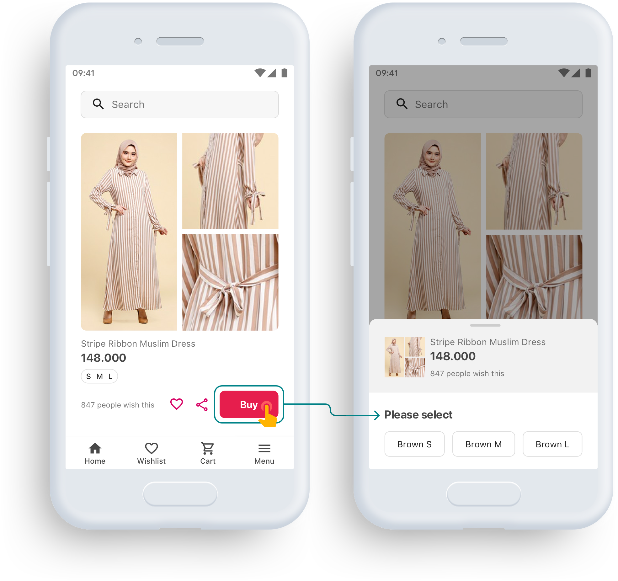
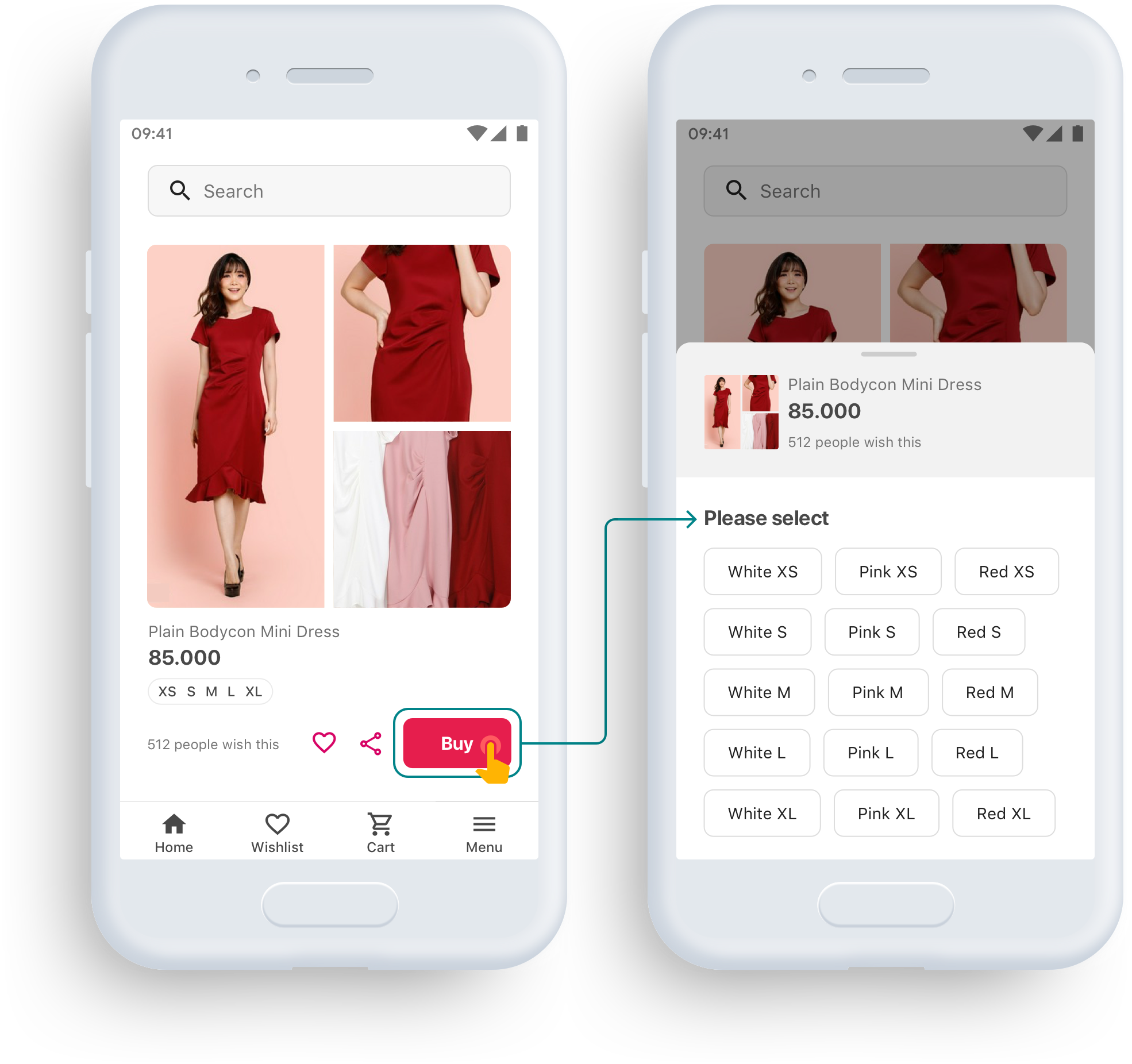
What if there were high numbers of variants?
We were planning to increase the (fashion) product variants and there was a problem with how we presented the variants.
There was also another problem with more variants because we define the ‘color options’ with words …
What color would you define this blouse?

What if there were 3 colors for this blouse?

What name would you give to each color to make sure users know which color the names refer?
Imagine if there were more than 3 color variants …
role & responsibility
Design & research from end to end
I did all the works from talking to the stakeholders, doing the research and tests, analyzing the data, designing the flow and interfaces, as well as deciding on the trackers.
goal
Accommodating more variants while maintaining the add-to-cart rate
The goal was to design a new arrangement to accommodate many more variants.
Event though we would not increase the number significantly right away, it would be wise to design a solution that can accommodate many more variants.
benchmarking

1 color per product
vs multiple colors per product
The very first thing I did was learning from other online retailers from fashion e-commerces to the generic ones such as Amazon.
There were 2 main variations of arrangement:
1 color per product
Multiple colors per product
With the assumption of putting color variations side by side to eliminate extra clicks, the ‘1 color per product’ arrangement suits products with a few color variations which is the opposite of what we were trying to do.
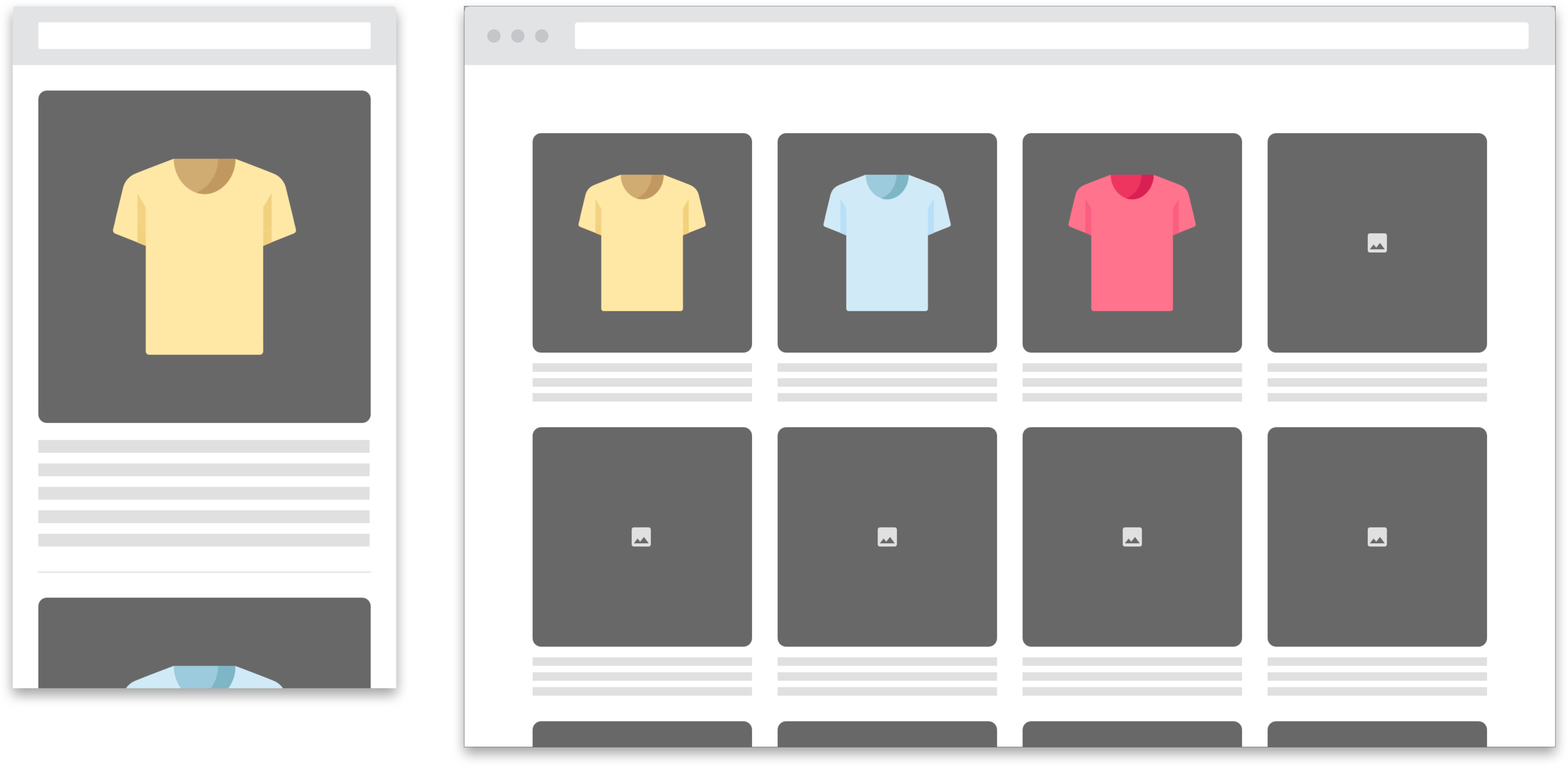
If there had been a lot of variants, how long would it had taken to scroll past a clothes?
In addition, we only had a mobile site — more than 95% of our users used mobile to open our 1-column product list. Therefore, users wouldn’t be able to compare the color variations side by side anyway.
But, what if we only show the most popular color at the top then leave the rest of the colors buried at the bottom of the page? Will more options confuse the users anyway?
Well, it would defeat the purpose of this project because the point of adding more variations was not to leave them untouched in the warehouse. It would create more problems to the business by piling up unsold stocks.
Dividing every product into different colors (with the assumption of differentiating the URL) might increase our Search Engine Optimization (SEO) since there was a likelihood of users googling for a specific color in fashion.
Cost vs benefits
However, the deal-breaker to the first arrangement was it would take a lot of changes and works from many teams aside from product design and engineering team themselves:
Commercial team would need to change the product image template, would take more photos, upload, and maintain them.
Logistic team would need to change their product classifying and naming system.
Data team would need to adjust the recommendation system and adjust their tracking system.
By weighing the potential cost and benefits, I decided to go with the ‘multiple colors per product’ arrangement.
Color or size first?
There were still another 2 options that I had to choose: which one we presented to the users:
Color first
Size first (only Amazon* did this)
As there was only one that used the second approach, it was actually safe to go for the ‘color first.’ As amazon was not specialized in fashion, we could safely assume that Amazon chose an experience that suited most items they sold, which might be different from fashion items.
If there was only a short time to do this, the research would have been stopped at this stage. Since we had a time and didn’t have a benchmark with the same kind of target market that we had, we did a field study to confirm our hypothesis.
*When the project was being designed, Amazon had not changed its menu from presenting ‘the size first’ to ‘the color first.’
field research
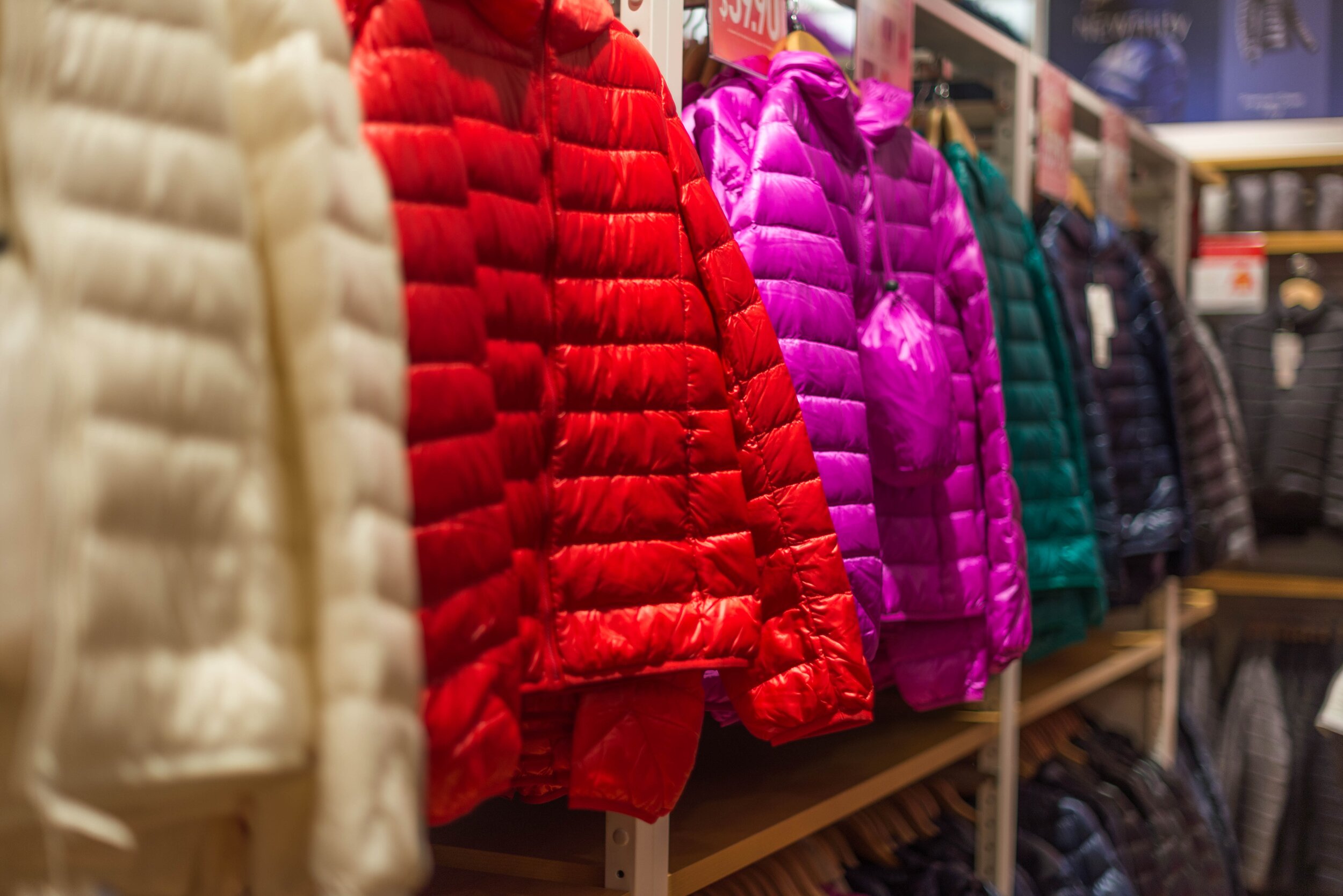
Photo by Roman Pohorecki from Pexels
Size or color first?
I dug deeper what I could not get from benchmarking.
To observe how our users browsed clothes offline, I went to some fashion stores.
Clothes were usually placed based on the looks (colors are part of the looks).
Except for the leftover items. The stores would dump all the leftover stuffs into one bucket and the customers would search any suitable clothes, but if you go to some outlet store, they will divide them into the sizes for the reasons that there is no way for them to group them into the colors because there were only few items with the same looks left.
I also noticed that customers who had average figures tended to go for the looks (color) first and those who did not have average figures (either extreme below or above) tended to go for the sizes first since it was harder for them to get their sizes. This was confirmed when I talked to a couple of customers in the store.
For the leftover items, it’s better to let users know of the available size first since the size options might be limited. However, our company did not sell the leftover items in our own website due to some business strategies.
The question then becomes which one were our users?
data analysis
Which type of users did we have?
To answer that question, I checked on our database what sizes had the higher sales. The common sizes had around 1.5 higher sales compared to the uncommon ones.
But, there was a high possibility that we sold common sizes way more than the uncommon ones. Therefore, I checked on the percentage of sold sizes per product view and the result was the common sizes still had higher percentage.
Another data that can be used as a point of reference was the top complaints.

Top complaints: Different looks (red) vs different size (green)
Based on our top complaints, people cared a lot more on the looks because the number of complaints of ‘How different the actual clothes from the images in the site’ were almost 6 times more than ‘how different the actual sizes from the measurements in the site’ with the assumption we had make sure the difference for both appearances and sizes as little as possible.
Therefore, we could safely assume that our users tent to choose the colors first.
solution
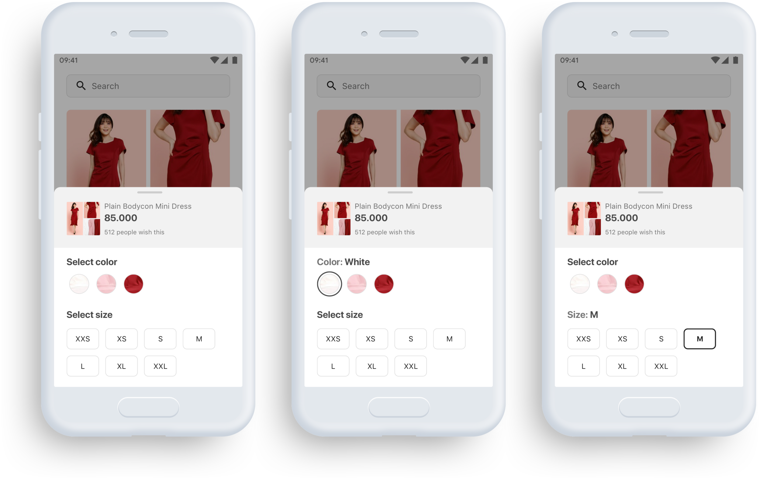
Divide variants into color and size
Present the color before the size
Change the color options into images
There were a couple of possible options to present the colors:
Cropped image from the display between each variant
Solid color (color pick from the image)
Text e.g. white, pink, red, etc.
However, considering the efforts, for MVP 0, we chose to go with the least effort first (the text option) to test the design …
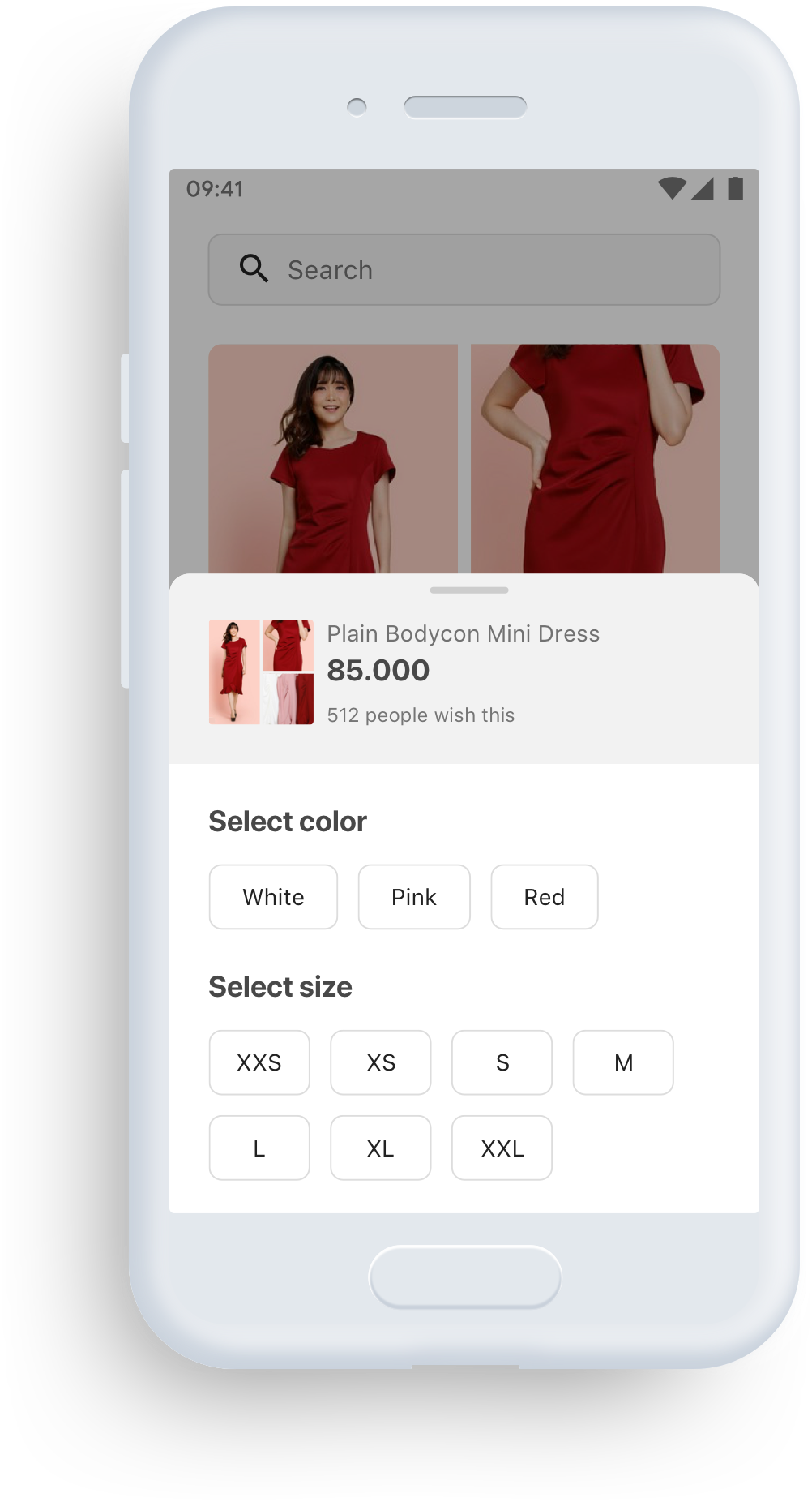
There was also a concern about the difficulty of tapping the option button if there was only 1–2 options because of their positions that were left-aligned. Thus, I checked on the average screen size of our users’ devices, which was around 5.12 inches. And, left-aligned was actually the right choice …

testing
Usability Testing
I did testing especially for some of the use cases to make sure users understand them:
1 color is out of stock for all sizes
1 size is out of stock for all colors
1 color is out of stock for 1 size
1 size is out of stock for 1 or more colors
A/B Testing
The ‘add to cart’ action could be done in either the ‘product list’ page or the ‘product detail’ page. But. based on data, our users had higher chances of doing it in ‘product detail’ page, therefore, we did the a/b test in that page first to minimize the effort.
When we had tested to 20% and 50% of our users, we would then test it to 100% of our users and would make it as close as possible to the real live which meant applying this not only in the ‘product detail’ page but also in the ‘product list’ page.
The test was run for at least a week even if we already had a statistically significant winner earlier to make sure the data catered the users’ behaviors everyday in a week.
For the trackers, I only needed to make sure that we differentiate the trackers between the color and the size buttons.
outcome
No decrease in add-to-cart rate
We were 95% confident that the new design would not cause any decrease in our add-to-cart rate while qualitatively improving the experience of selecting variants in our product.
reflection
Grasp and hold on to the goal throughout the project
At first, I thought the new design did not work when I took a look at the a/b test result which did not shows any significant difference between the old and the new design.
However, if we refer to the goal, it served the goal which is to accommodate more variants without decreasing the add-to-cart rate.
Should have carried on with the plan
Since it always takes some time for the development and the a/b test, I usually will have moved on to other project/priority when the MVP 0 has been fully developed and released. Therefore, the feature ends up staying as MVP 0, which happened to this project.
I should have kept track every project that I do.
System Design
Cross-Functional Alignment
Leadership & Influence
Superbank + OVO + Grab Integration
Designed the system logic and multi-surface UX for OVO’s savings product, aligning five design teams and multiple financial partners under tight regulatory and launch constraints.
UI & Interaction
Growth & Conversion
Product Discovery & Insight
Revamping Sign-Up Process
Redesigned the onboarding flow end-to-end to remove friction and clarify requirements, increasing registration success by 2.8×.
Move Without Authority
Moved complex initiatives forward without formal authority by challenging assumptions, reframing constraints, and restructuring incentives across product and organizational systems.