
UI & Interaction / Growth & Conversion / Product Discovery & Insight
Revamping Sign-Up Process
The number of sign-ups had been a huge drop in the onboarding funnel compared to the considerably high number of app installations.
state & condition
Early state of a new design system
A new design style was just established when the project started. Many design components and their behaviors had not been designed and developed yet.
Strict and rigid engineering process
Every project required a long process to get developed and tested which caused a huge amount of time and efforts from the related teams and departments. For instance, it took almost one and a half year just to release this project.
Approval from management for every decision
Engineering team could not cater every request.
The amount of requests, the specialization of every team, the communication flow between each team and department, as well as the need to comply to the government rules made it impossible to determine the priorities without participations from every party.
Therefore, almost every initiative needed approval from the top management that consisted of chief officers from each department.
Disorganized tracking system
If you wanted to fix any problem, the option was either to go through the long approval process or to slip in the solution to any scheduled project. And, one of the recurring problems that was not fixed yet was the event tracking system.
Besides tracking only the number of views of each page, the tracking results were pretty unreliable; for instance, you could find an increase instead of a drop at the end of a funnel.
goal
Increase the sign-up rate
Besides increasing the sign-up rate, we also implemented the new design style.
role & responsiblity
Design & research from end to end
I did all the works from communicating with the stakeholders, building the wireframes, sending out the surveys, designing the flow and interfaces, as well as synthesizing the data.
I got helped by 2 researchers in the early stage of the project to test out the old flow, 1 UI designer at the end of the project to implement the design, and 1 illustrator to visualize the value proposition,
old design


Value Proposition
Users get past without getting any of the value propositions.
They did not bother to take some time to read the messages. What they did was to find out as soon as possible what they needed to do to get to the next section.
Sign In or Join Now
Users filled in the ‘Phone Number / Email’ field that was meant for sign in, but then tap the ‘JOIN NOW’ button.
Users thought they had to enter the field first before clicking any of the 2 buttons below.
Enter Personal Info
During the usability test, users spent most of their time in this page.
They thought empty ‘Promo Code / Reference (optional)’ field was the cause of the disabled button; therefore, they tried to fill in the field even without knowing what information should be entered.
However, the disabled button was caused by the unticked of the ’I agree with the Terms & Condition’ checkbox at the bottom.
The largest drop according to the data happened in this page.
We thought that the cognitive loads in this page were the highest among any other page because there were many fields to be filled in 1 page, compared to the other page that had only 1 field the most.

Verify Phone Number + Verify Email
Users tended not to realize their Android phones had automatically read their One-Time Password (OTP) SMS and filled in the code for them. Therefore, they mistakenly filled in their OTP codes into the ‘Verify Email’ page which led to an error and confusions.
The second biggest drop in the old flow happened in the ‘Verify Email’ page.
We assumed it was not only because of the wrong code error, but also because many users did not even have email. This was proven by the big amount of cryptic, unverified email addresses in the database. They carelessly made up their emails to fill in the ’Email’ field in the ‘Enter Personal Info’ page without knowing that they needed to verify later in the process.

Create Security Code + Verify Security Code
Users was confused when they got into this page because the term ‘security code’ was not common.
Other applications used ‘PIN code’ term instead of ‘security code’.
The other problem was all pages with similar code fields showed up consecutively and all the pages were too similar to each other.
The only differences were only in the instructions and none of the users are aware of the differences because nobody read thoroughly.
Success
No one read it.
None of the users could recall the written text because they clicked the ‘AWESOME’ button right away.
However, they were aware that they had successfully registered.
flow adjustments

Combine the registration and login flow
We combined both the registration and login flow by asking all users to enter their phone numbers. We would then verify their phone numbers and check whether their phone numbers had been registered before to automatically assign them to the respective flow.
We were fully aware of the risks of combining the registration and login into a single form:
It might lead to an error where existing users mistyped their numbers and ended up registering. However, it would not happen in this case because users needed to verify their phone numbers first before they were directed to the respective flow.
Having one form serves as 2 different functions could be confusing to users. Therefore, we did a lot of qualitative testings by dividing users into 2 groups. One group was instructed to sign in while the other to register. The result was that users did not even focus on the wording they simply followed their instincts and did what was asked in the page.
Divide the 1 page form into different pages
We also divided the other personal informations into different pages to minimize the cognitive load and separated those pages with code fields (SMS OTP code and Security Code) so users would not be confused because they had to fill in different codes consecutively.
Remove unnecessary fields
Promo code was unnecessary so we removed it from the flow.
We actually intended to move email from the registration flow to the later phase in the app.
However, some departments such as marketing, risk, and compliance still needed some time to transition from getting users’ emails from the beginning. Therefore, we planned to remove it gradually by putting it at the end of the flow for now. The plan was to remove the verification (only ask for the email information without any verification) first and then remove the email field completely from the flow.
Use common term(s)
We actually planned to change the security code term to PIN code, however, it took a lot of works because the term security had been used throughout the app, so we kept it as it was for now.
Offer users to upgrade their accounts
At the end of the flow, we offer users to upgrade their accounts in order to increase the low exposure of the account upgrade offer.
quantitative research


Even if we had done a qualitative test, we needed to do a quantitive one just to get approval from the management because they did not buy a qualitative result.
However, we did not have a proper quantitative tool to test a flow at that time; therefore, we used what we had with some adjustments to accommodate the tool’s drawback. For instance, we enlarged the hitzones bigger than the actual clickable areas to avoid any slip because the tool only allowed users to click once at the right spot otherwise they will fail to finish the flow right away.
high fidelity design

Since we did not have the new style for this kind of form yet, we designed the interface components as well.
We initiated a new button behavior which is there should not be disabled buttons in order to let users click the button to get a direction of what needed to be done before continuing.
Other improvement we did was users did not need to to tick a checkbox anymore to agree on the Terms and Conditions (T&C). Instead, we put a text on top of the CTA button that said by registering, users agreed on the T&C.
Value Proposition

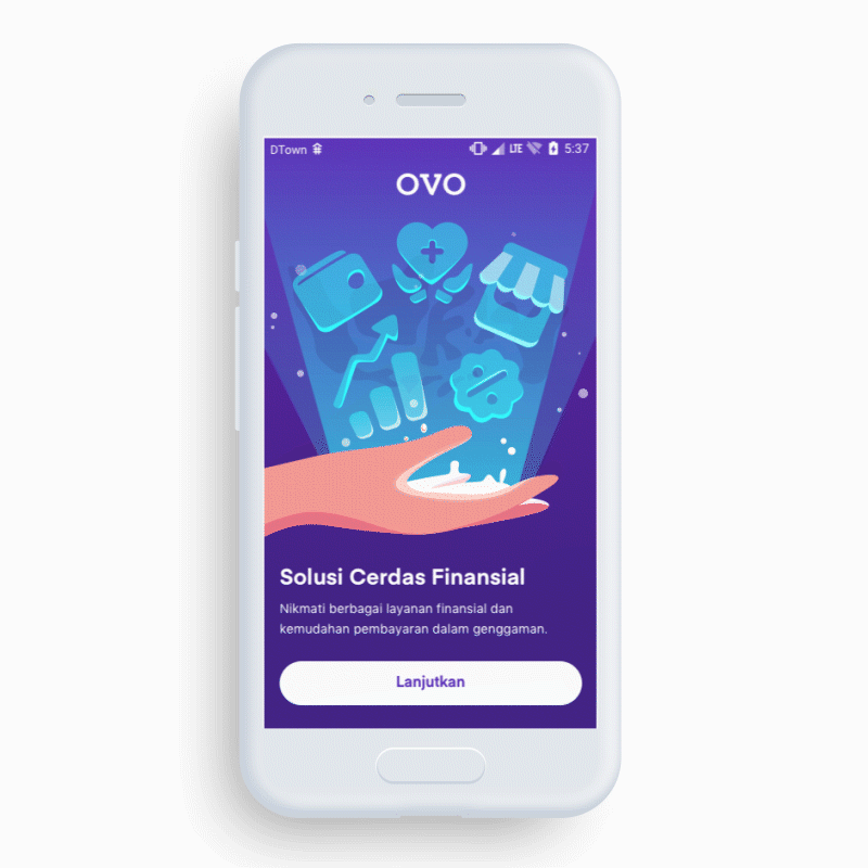
We asked for advice from the brand team in marketing department for the value propositions.
This was what was proposed:
Versatile Financial Solutions
To pay this and that, PayLater, Insurance and Investment in a Secure, Fast, Universal way in Indonesia.
With the propositions in mind, we decided to get back with multiple options for the illustration concept.
After having some discussions with the related teams, we considered concept 2 and concept 6 with both having the same concept which is “everything is in your hand.”
However, there was a consideration of making it gender neutral, therefore, we had 2 options:
Concept 2 and illustrate the hand to be as genderless as possible
Concept 6, but draw 1 more person with different gender standing at his side.
In the end, we chose option no 1 (concept 2), because the other option would distract viewers from the main message which is a ‘one stop solution for financial services.’
In addition, we were afraid if we put characters in our front page, the characters would be perceived as our mascots.
For the wordings, we tested them to users, however, it ended up:
Readers had difficulty of understanding the meaning because there were too many messages in one sentence. At first, we showed it in 5 seconds—because users would not take time to read it slowly in real life— and nobody got it.
Too many self-proclaimed values which made users felt too hard selling
Since we would have already dedicated landing page for our main value propositions inside the app, we reduced the value propositions to the ‘one stop solution for financial services’ and highlight the ‘payment convenience’ benefit which is not that strongly represented in the illustration.
outcome
Increased by almost 3 times
The new registration’s success rate had almost 3 times the old’s rate.
As predicted, the biggest drop-off happened in the ‘Verify Email Address’ page. Therefore, the next improvement was pretty obvious which was to remove email verification and eventually not asking it.
The next project, however, had not been picked up when this article was written.
reflection
Keep the feature release small
The limited engineering resources and the long approval process urged us to insert more improvements and expand the project scope due to the low possibility of the next improvement to get picked up.
However, it was the right decision not to push too hard for the email removal in the registration flow; since, in a hindsight, if we forced the email removal into the scope, there would be a high chance of this project to get dropped.
Share data & insights to the engineers
There were some resistances from the engineers to develop the design even though, at the end, they realized it was the right one.
We should have involved the engineers as early as possible and should have shared the data and insights that influence our decisions.
System Design
Cross-Functional Alignment
Leadership & Influence
Superbank + OVO + Grab Integration
Designed the system logic and multi-surface UX for OVO’s savings product, aligning five design teams and multiple financial partners under tight regulatory and launch constraints.
Move Without Authority
Moved complex initiatives forward without formal authority by challenging assumptions, reframing constraints, and restructuring incentives across product and organizational systems.
UI & Interaction
Product Discovery & Insight
Growth & Conversion
Adapting More Variants
Scaled the product detail experience to support more variants using a reusable pattern and component updates that preserved clarity and increased add-to-cart performance.